
Service
Visual Journalism
Formats
Broadcast & QGIS
Mapping the California Wildfires
The January 2025 LA wildfires were the most destructive in California history. I'd already mapped them for broadcast at CNN. They were built fast, under pressure, with almost no confirmed details to start. After the story moved off air, I came back to it with a different goal. I wanted to rebuild the same maps in QGIS to learn the tools a digital team actually uses, and to understand how mapping changes when the format does.
Output
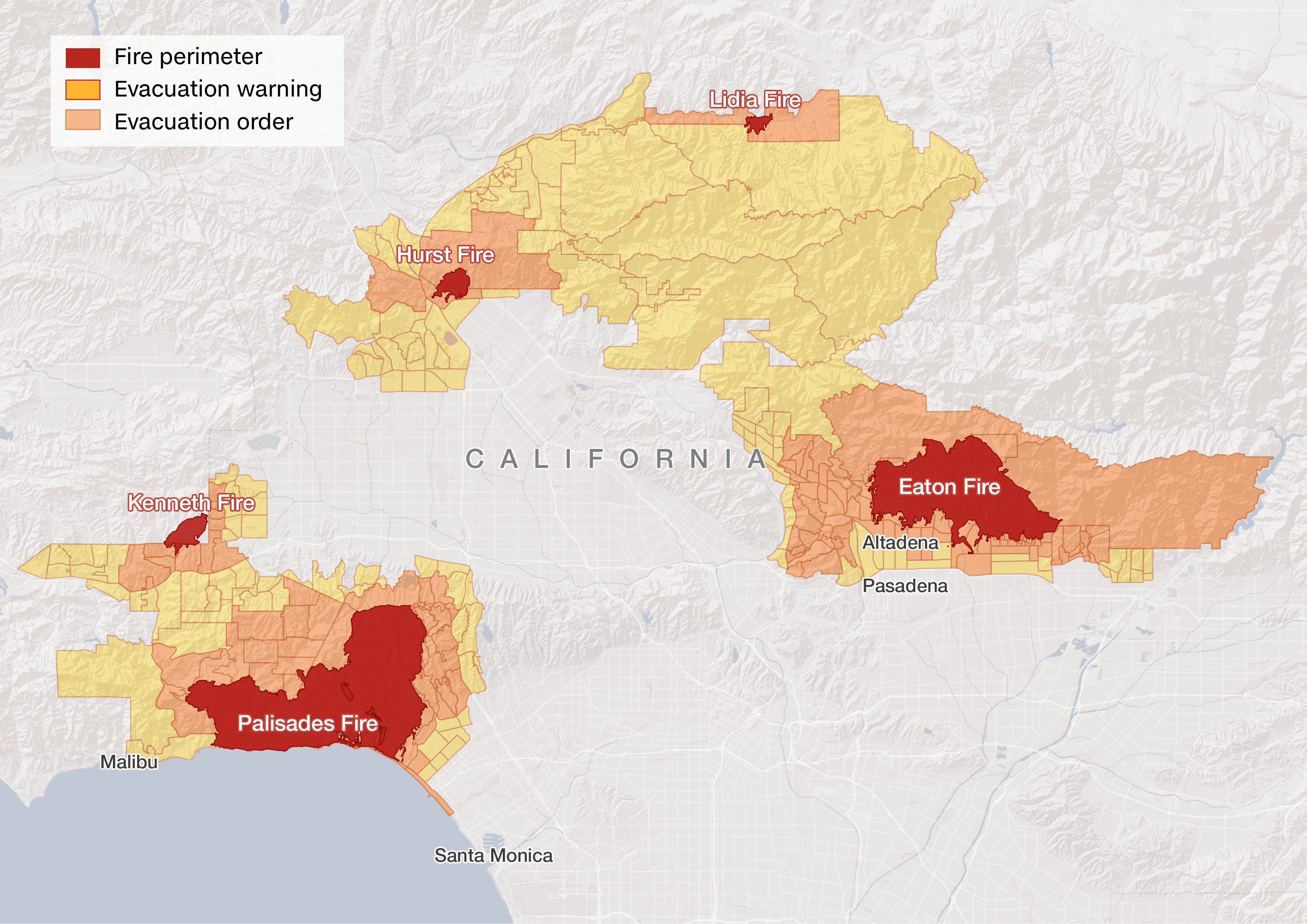
Digital maps built in QGIS
QGIS maps
Built in QGIS using fire perimeter and evacuation zone data from the City of Los Angeles GeoHub and LA County, with place-name boundaries from the U.S. Census Bureau TIGER/Line files. Fire perimeters represent the maximum burn extent as of January 31, 2025. Evacuation zones distinguish between mandatory orders and warnings.




Broadcast maps
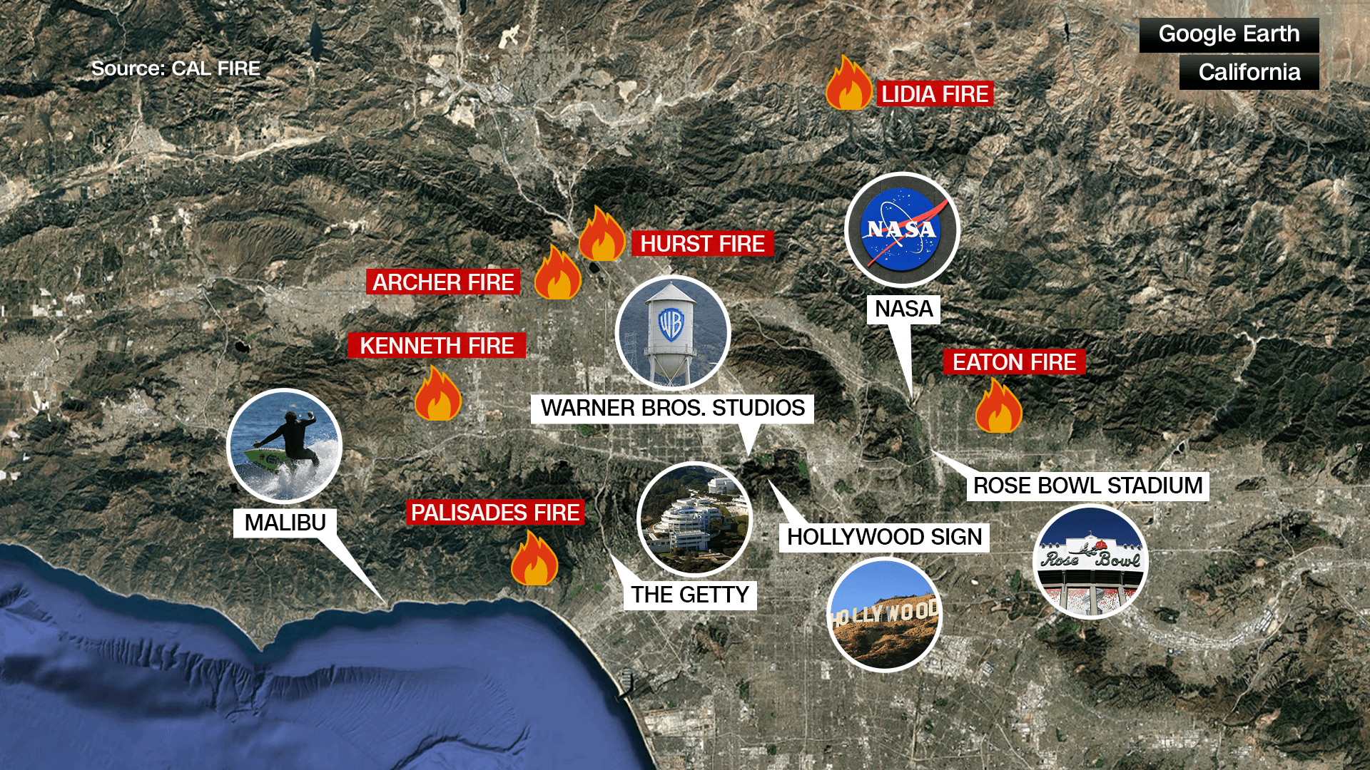
Built in Photoshop and Viz World Maps using reference maps provided by various show producers. For this news story, I partnered with the visuals team to source reference material and raw data, which I plotted using Viz World Maps. Unlike the self-directed QGIS work, this map was a collaborative broadcast deliverable.

NEXT PROJECT
